Probability Contour Plots
FlowJo draws only one type of contour plot, using equal probability contouring. This algorithm generates, in general, graphs which are most accurately interpreted by our brains, in terms of relative frequencies of subpopulations. All contouring algorithms have advantages and disadvantages, but probability contouring is probably the most informative. Combined with the display of outliers, this generates an extremely informative graphic that does not over-emphasize narrow peaks nor hide low-frequency information.
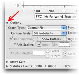
There are several options available in drawing the plots (available by clicking the Options disclosure triangle in the Graph window). These include the option of drawing "2%", "5%", "10%", or "Logarithmic" contour plots, "smoothed" or not, and "outliers" or not. Contrary to the belief of many people, smoothing does not alter the data nor does it distort it. Thus, it is by default left on. Note that turning smoothing off can cause the program to take much longer to draw the plots. "Show Outliers" controls whether events falling outside of the lowest contour are drawn with dots--thus, combining the best advantages of dot plots (revealing low-frequency data) with the best of contour plots (allow high-frequency data to be accurately displayed). 2%, 5% and 10% plots have 50, 20, and 10 contour lines (respectively) that are distributed so that the same number of cells fall between each pair of contour lines. Logarithmic plots distribute the contour levels logarithmically in height; each contour line encloses twice as many events as the previous.
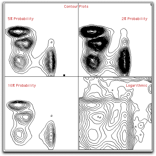
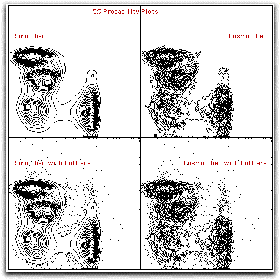
The first set of graphs below compares the same data using different contouring thresholds. The second set of graphs compares 5% probability plots with different options.
You may view a comparison of all the bivariate displays for this same data.