Display Comparison
Four ways of displaying exactly the same data are shown below.
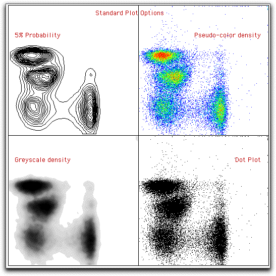
Of these, the Dot Plot is the least desirable: it conveys the least information as to the density of events (because in areas with a lot of events, the dots are saturated, and it becomes impossible to note any more events). Also, unless you choose to display all events as dots (in the preferences dialog), then not all events will be shown.
The density plots have many options for changing their looks; the pseudo-color and grey-scale plots are essentially the same with the exception of the colors chosen. (The two shown here have different options selected). See the page on density plots for more information.
The contour plots give the most balanced view of the data. However, rare events may be missed because they are outside the contours. This deficit can be overcome by selecting to display outlier events. See the page on contour plots for more information on these options.