Density Plots
Bivariate density plots are computed exactly the same way as are contour plots (equal probability contouring). This algorithm generates, in general, graphs which are most accurately interpreted by our brains, in terms of relatively frequencies of subpopulations. All contouring algorithms have advantages and disadvantages, but probability contours have the fewest disadvantages.
There are two types of density plots: grey-scale and pseudo-color. They are identical, except the color scheme is different. Grey-scale may be more acceptable for publication; pseudo-color may be more acceptable for slide presentations.
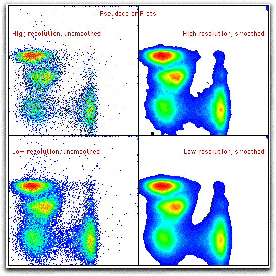
There are two options that apply to density plots: smoothing and high resolution. The graphs below (shown for pseudo-color plots) show the effect of these options. Note that with smoothing off, every event gets a dot; thus, this plot is much better than dot plots, since it allows the simultaneously information of rare events (dots) and high-frequency areas (dots of a different color).
You might choose low resolution to make data easier to see in presentations: the small dots can be hard to see on slides.
You may view a comparison of all the bivariate displays for this same data.