
Principal Component Analysis (PCA)
PCA is an algorithm for reducing the dimensionality of a data set based on variance, while retaining the discriminatory information.
Theory
Imagine a data set as a 3-dimensional dot plot floating in the middle of your office, so that you can walk around it and look at the data from any angle you want. From some angles you will be able to distinctly visualize groups or clusters of cells separating themselves from each other. From other angles it will be harder to see those separations, but others may appear. If instead of asking you to walk around the data, we instead rotate the data and then draw a 2-dimensional representation of what we're looking at this is called projecting the data, and it's what PCA does to show you the separation in a data set.
PCA creates this projection by multiplying the data by a vector that transforms it into the rotated version of itself that provides the best view of the differences in the data. There are an unlimited number of vectors that the data could be multiplied by. What differentiates one data reduction method from another is generally the criteria used to select the best vector for multiplication.
In PCA the metric is variance; the data will be projected in the direction that demonstrates the most difference between the cells. Returning to the 3-dimensional data example in which the data would be plotted on an x-y-z axis system, this projection becomes the new x-axis. We call it Principal Component 1, or PC1 for short. The vector the data was multiplied by to create PC1 is the first eigenvector.
The process can then be repeated to find the vector that produces the second most variance, and call this PC2. The stipulation that only vectors orthogonal to the first eigenvector is used so that when we produce PC2, it can be plotted versus PC1 to create a classic 2-dimensional plot. This process can then be repeated for as many principal components are necessary to map all of the variance within a data set to the set of components.
Practically, a cytometry experiment will have many more measurements made then the three in this thought experiment, so the search for the optimum eigenvectors is performed in high dimensional space using matrix algebra. Essentially a series of equations is set up, and when one is solved for the value that maximizes the variance, the rest can be solved for as a system. Wikipedia provides more detail if desired.
Application
Access the platform by clicking on the target population and selecting the Platform menu, Dimension Reduction choice, PCA tool. The target population can be anywhere within a gating hierarchy. In the figure below, clean up gates have been applied to the collected events and PCA is being applied to the CD56- population.
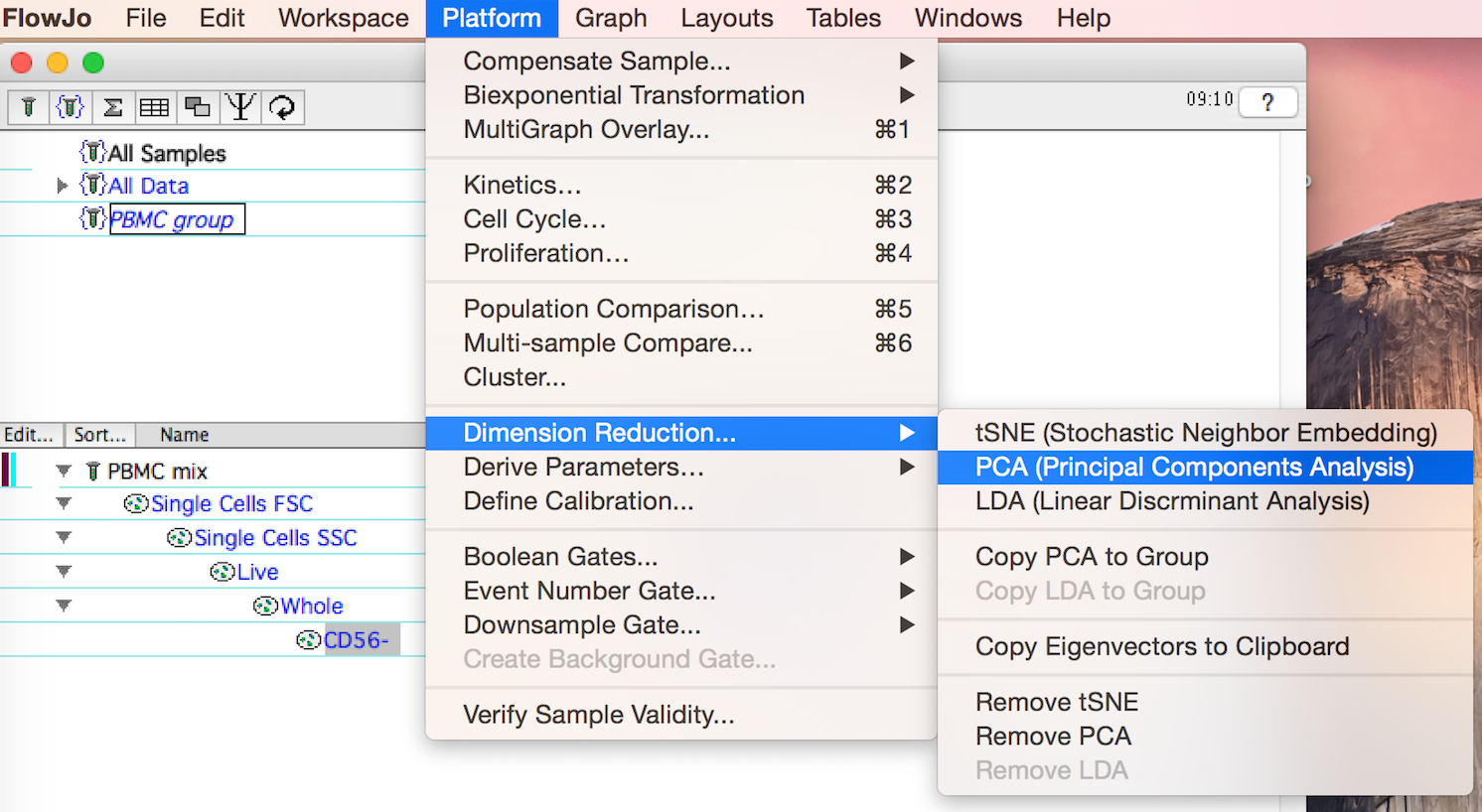
Figure 1: The Principal Component Analysis Tool is under the Platform menu
The PCA menu will appear. To initiate the algorithm:
- Enter a parameter prefix; the default value will be a 'P' proceeding all PCA produced parameters
- Select the parameters to be used in PCA from the drop down selection.
- Click 'Compute'
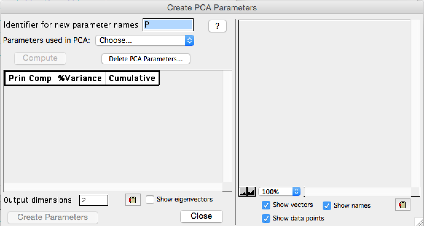
Figure 2: The PCA interface at initiation
In this example 'Show table to select...' was used to select two scatter parameters and a subset of compensated fluorescent parameters. CD56 and 7AAD were omitted as gates have been created upstream that removed all of the 7AAD+ and CD56+ events, so these parameters no longer have any discriminatory power.
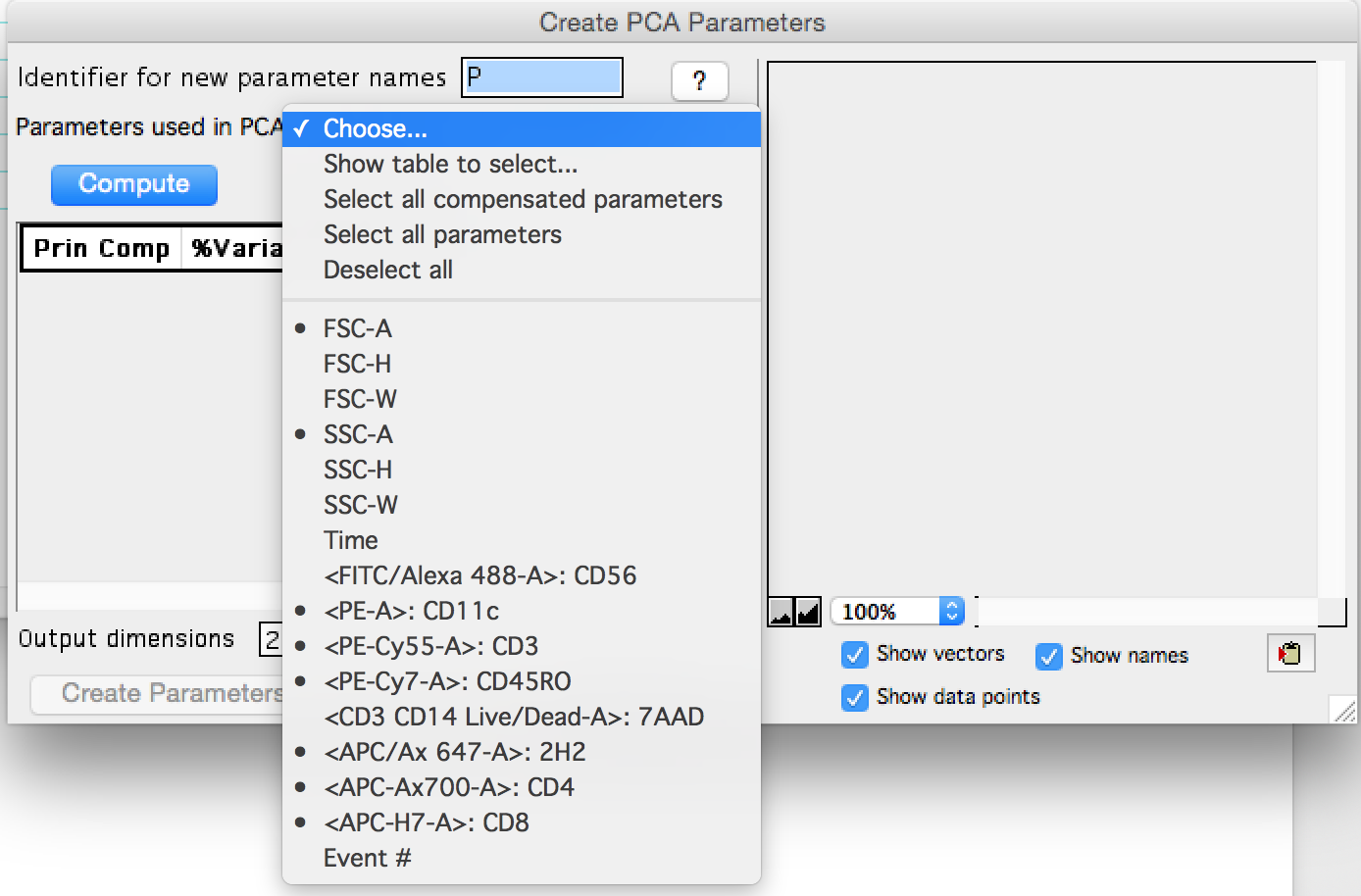
Figure 3: Parameter selection
After compute is clicked, plots of the resulting transformed data will appear on the right, and a table of the variance explained by each PC will be shown on the left. All eight, in this example, PCs were calculated immediately; the Output dimensions box which is highlighted in the plot below, can be modified at any time to show more or fewer components in the plots.
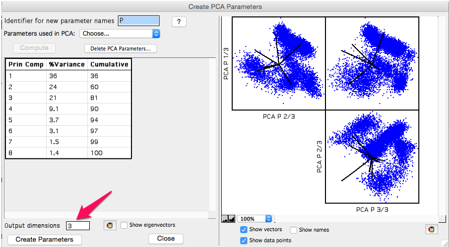
Figure 4: Output screenshot
As the principal components are ordered by variance explained, the first few components will be the most important to look at. The tabular output shows the variance explained per component, followed by the cumulative amount explained by the component plus all components above on the list. In this example the first three principal components explain 81% of the variance within the data set. We may want to include the 4th component in the output, which would get us to 90% of the variance explained, but then the rest of the components reach the point of diminishing returns.
Click 'Create Parameters' to add the number of principal components to your data as specified by the Output dimensions. The principal components will appear in the list of parameters using whatever identifier was specified.
If 'Show eigenvectors' is checked on the eigenvectors will display in the window. The clipboard tool can be used to copy the output table, and the eigenvectors can be used outside of FlowJo to reproduce the transformed data. There is also a choice within the platform window to 'Copy eigenvectors to clipboard'.
Lastly, tools for editing the display of the principal component plots appear below the graphic, including a copy to clipboard option.
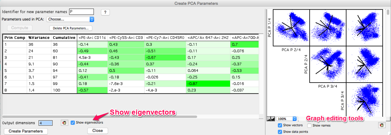
Figure 5: Eigenvectors displayed
Use and Interpretation
Plotting PC1 versus PC2 as a contour plot produces a series of obvious populations. In the figure below, elliptical gates were used to gate the 6 obvious populations. Because PC's 3 and 4 contributed significantly to the variance, they were looked at as well and gates 5 and 3 turned out to have a few obvious separations. Overlays were then created to suss out what each PCA population was biologically. The figure below shows the initial gates, the overlays, and a table of the terminal populations.
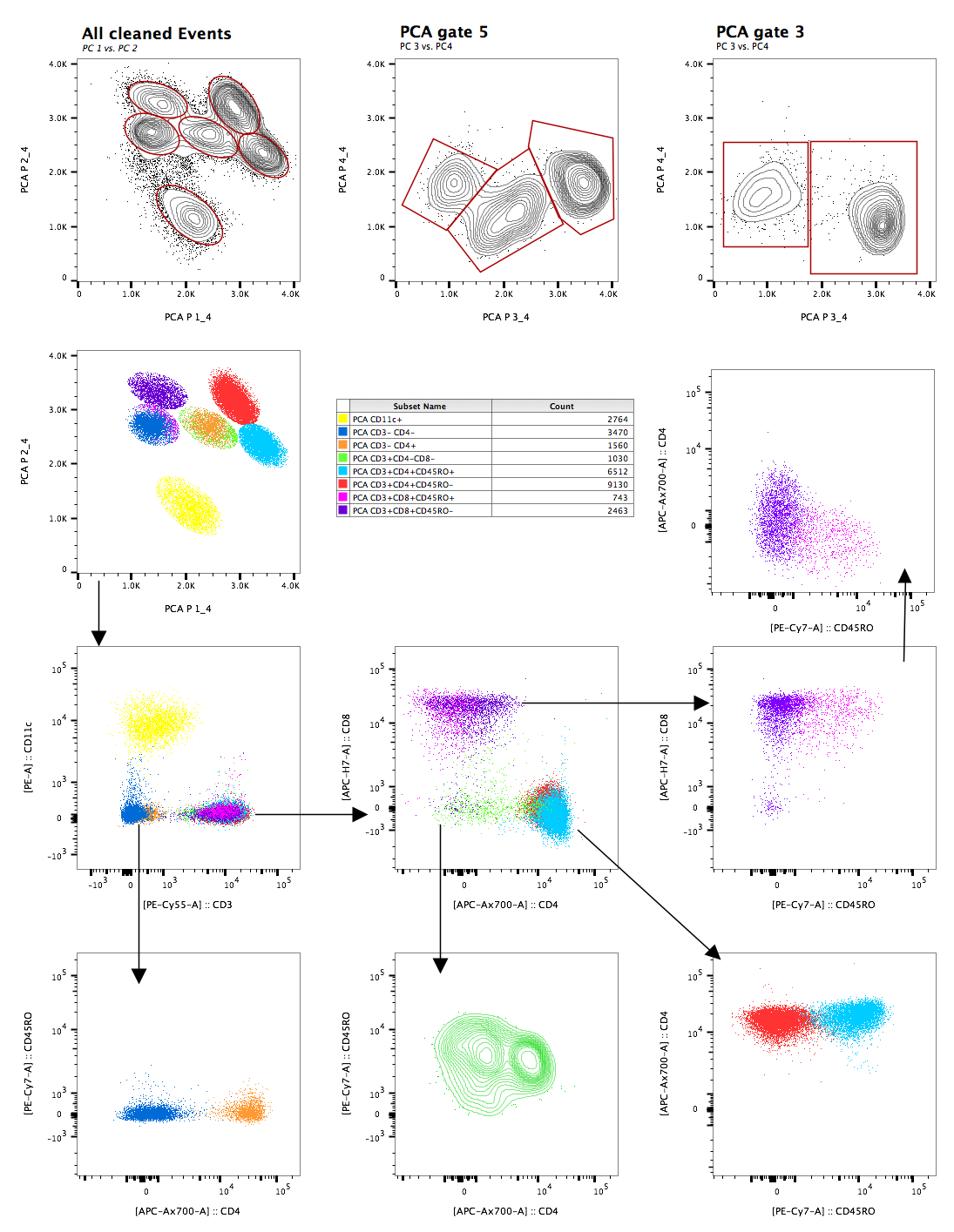
Figure 6: PCA outcomes
One other tool that is useful in examining PCA derived plots is the polychromatic plot. Because the ploychromatic plat can be used to apply coloring to a plot based on parameters that are not necessarily the parameters displayed on the x and y-axes, the PC1 and PC2 can be plotted and explored to see what parameters the populations express. In the figures below the legend on the left shows the parameters identified by color, and the plot on the right is of the PCA parameters, colored by this scheme.
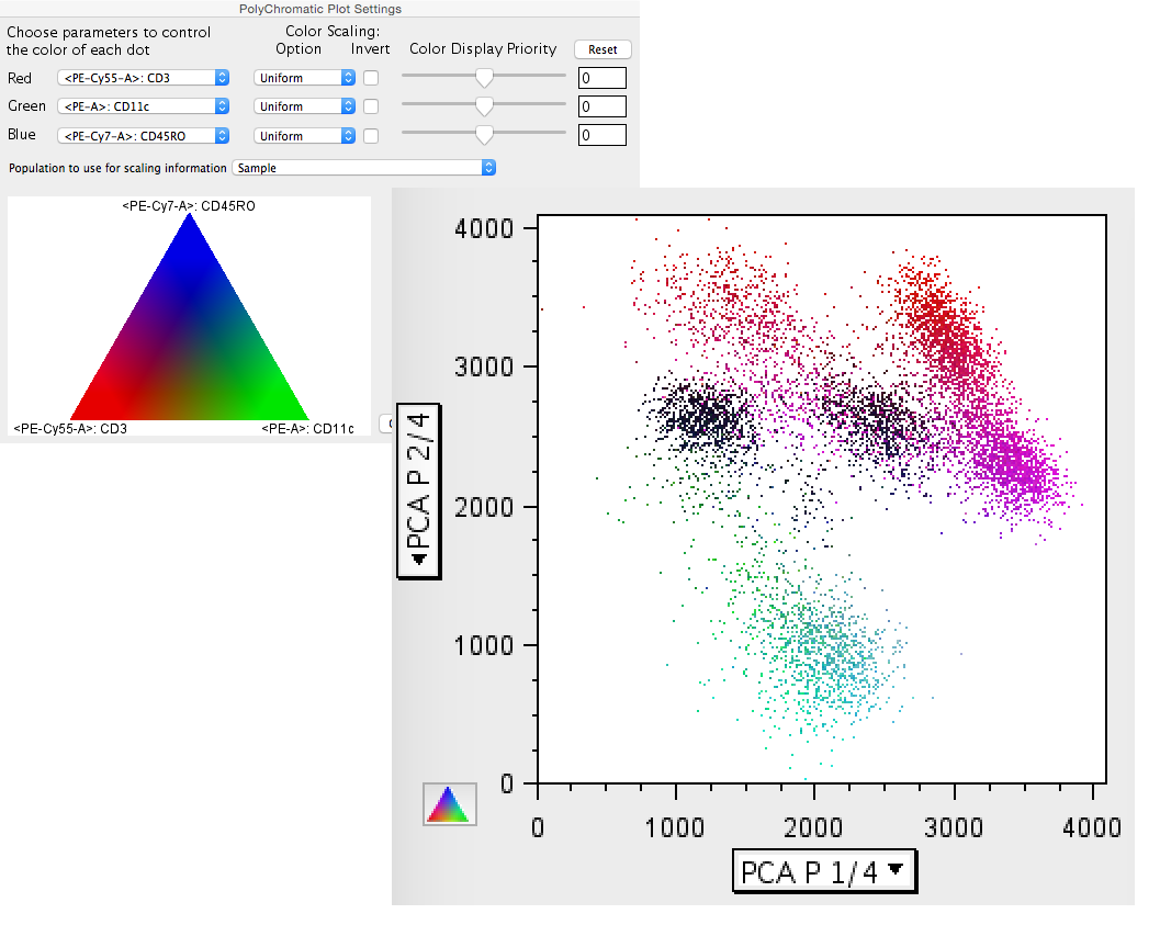
Figure 7: Polychromatic utility with PCA