Graph Overlays and Legends
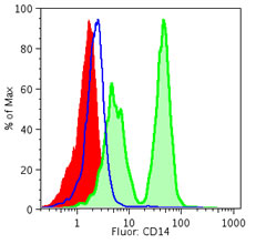
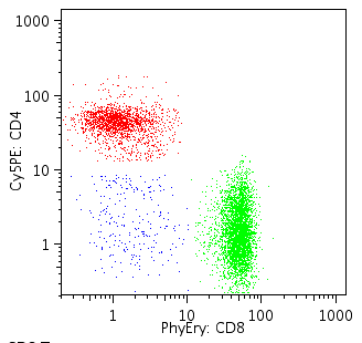
Often it is useful to plot two or more data sets or population on the same axes. This makes it easy to compare the data, using differing colors to show multiple populations at the same time.
Overlays may be created on either univariate (right) or bivariate displays (below). Within the Layout Editor you can edit the color and order of the items, to customize the look of the overlay graph that best highlights your data. Once an overlay has been defined, the layout editor can create the same graph for many different samples or sets of samples, by iterating over a group in the workspace.
To create an overlay, drag a graph into the Layout Editor. Then drag a second on top of the first one. As the mouse moves into the original graph item, you'll see that it highlights its borders to signify that it will accept the contents of the drag. Drop the second graph (or more, if you had multiple nodes selected in the workspace) on top of the original, and an overlay is automatically created.
The Overlay Legend

As soon as you release the second node on the first, the graph will change into an overlay. Overlays are recognizable by the existence of a legend on the right side of the graph. The number of the rows in the legend shows the number of layers in the overlay. The graphs often change from black and white to color, as each data set gets its own color within the overlay.
The legend provides the user interface to edit several aspects of the overlay. Click the mouse once on the legend to select it. Then pass the mouse over different areas of the legend to see to change the cursor to signify the different editing operation that are available.
When the mouse passes over an edge of the legend, the cursor will become a hand. Clicking the mouse on the outside edge of the legend lets you move or resize the legend.
If you move the mouse over the text description of the layers, you'll see the cursor become a pair of bars with vertical arrows sticking out of it. This tools allows you to reorder the legend. The order of the lines in the legend mirrors the order of the graphs displayed. Moving a graph's name to the top of thelist moves the graph to the top of the overlay stack. Because events in front can obscure others, you may want to have the smaller populations on top of the larger ones, though this depends greatly on the context of your analysis. Dragging the order of the layers will cause the graph to be redrawn, so you can quickly see which layers you want to feature in the top positions. If you hold down the option key, you'll see that the cursor changes from a vertical reordering tool into a trash can. This signifies that option-clicking a layer in the legend of a graph will delete that layer from the graph.
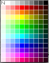
Clicking the mouse in the colored box at the left side of the legend will pop up a rainbow palette, to let you change the colors of the layers in the graph.
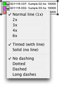
If the graph is a univariate (a histogram or cumulative distribution function) the line weight and fill style of the graphs are also editable from a dropdown menu under the line style box. (Right) This is the gray and white square just to the right of the color box. It is only visible in the legend of a univariate graph.
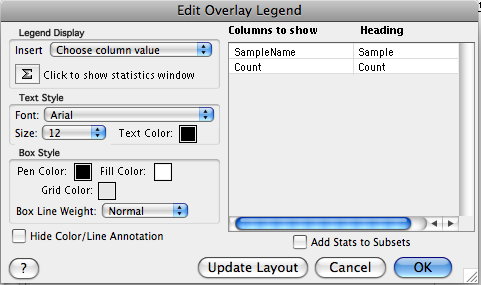
The content of the legend itself can be edited by double-clicking on the text of the legend. This produces the Edit Overlay Legend dialog shown at the left. Here you can select color and style for text, box and background. You can add column header names by clicking in the cells underneath the Heading column of legned Edit Overlay Legend window. the You can also choose to display more information using the Insert button. To preview the legend before accepting changes click on the Update Layout button.
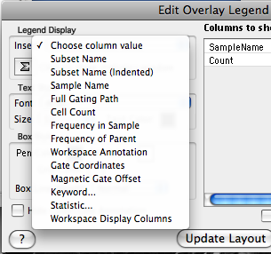
Choose Column Value displays a dropdown list. Selecting a value here places it in the Columns to Show in Legend box. When you select OK the graph will display the new column and its values for the populations in the overlay graphs. All keywords available in your data files, as well as Workspace Display Columns and all statistics are available to place into the legend.
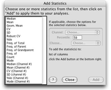
Just below the Insert button is the Sigma button, which opens the Add Statistics dialog window. Here you can choose from a list of statistics that will be added as columns to the Overlay Legend. Several statistics are repeated with (channel#) appended. These statistics will be reported for their values in channel space, the others in scale space.
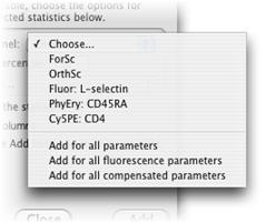
Select the channel to which your statistic should be applied from the Channel dropdown list. Note the additional options:
- Add for all parameters
- Add for all fluorescence parameters
- Add for all compensated parameters
To save time, you can set your preference for the keywords you would like FlowJo to display in the legend by default. Go to FlowJo -> Preferences and click on the Tables and Layouts tab. There you can select the Default Columns in Legend.
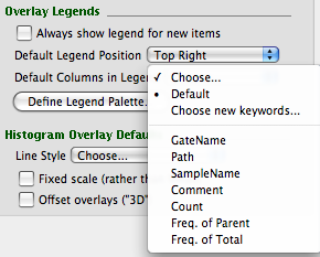
Using these options will save you the tedious job of selecting and adding each channel individually. Unwanted channels can be deleted from the Legend by control-clicking.
The legend is used to control all of the attributes of the graphs appearance. By default the legend is visible if there are multiple items in an overlay, and hidden for single histograms or 2D plots. If you want to edit the color, line weight, or dashing of a single graph, you can double click on the graph, and set the Show Legend attribute of the Annotation panel.
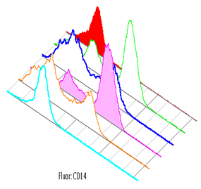
Histograms can optionally be offset when they are overlaid, so as to distinguish the curves better. The feature, as well as how much of an offset is used are specified in the Annotate panel of the Layout Item Definition dialog, summoned by double clicking the graph (or selecting it and choosing Get Info... from the Layout menu).
