Graph Gallery
The examples shown on this web page were created using Canvas from Deneba software; however, any drawing program can perform these operations. Each plot took only a couple of minutes to create; the steps performed are listed below each plot.
Example 1: Contour plot with outliers.
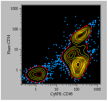
To generate this plot, the preference "Export all graphs as high resolution PICTs" was checked in the preferences dialog. A contour plot (with outliers) was displayed on the screen, and the graph was copied (cmd-C, or "Copy" under the "Edit" menu). In Canvas, the graph was pasted into the document window. Ungroup the objects once to separate the internal graph objects from everything else. For the graph contents, select a foreground color of yellow and a background color of black. The contents were ungrouped again: each contour level is grouped: the outermost level was selected, and the line pattern was changed to 2-pt width, dashed line, and red. The fifth, 10th, and 15th contour lines were changed to red. At this point, all outlier points are still grouped; select the outliers, change the color to cyan and a 2-pt penwidth.
Note that the axes, axis labels, and parameter labels are all grouped in logical order so that you could easily change the text font, size, style, or color easily.
Example 2: Overlayed histograms.
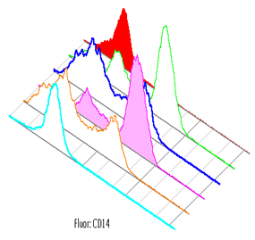
This plot was generated in FlowJo's Layout Editor. A single node was dragged from the Workspace window to the Layout Editor. Five other nodes were then dragged onto the existing graph in the Layout Editor. Colors and line/fill options were chosen from the legend for each histogram. By double-clicking on the graph, you can choose to "Offset Overlayed Histograms" and remove the axes.
Return to the general information on generating publication quality graphs.